Exploratory research for A.I. search tool viability
An A.I. tool aims to improve user experience — but are there other problems that need to be addressed?
User Experience Research | Lean Methodologies | A.I.
Like many organizations, the Ministry of Justice developed an appetite for A.I. as a potential salve for poor user experience and high costs. As part of a task force examining areas of the Ministry that might benefit from A.I. capability, I engaged in lean research to understand the baseline experience for justice.govt.nz. This rapid work uncovered a disjointed search pathway that ultimately would be further obstructed by an A.I. search assistant, terminating the initiative.
Role: User Experience Researcher
Team: Business Analysis
Methods: Interviews, Observations, Usability Testing
Will a chatbot provide a better user experience?
In late 2023, the Ministry of Justice explored a range of Artificial Intelligence applications to increase efficiency and improve user experience while saving money. One exploration was surrounding the use of an LLM conversational search function (i.e. a chatbot) on the Ministry of Justice website (justice.govt.nz) to improve access to Justice information by the NZ public.
To set a baseline of user experience, it was necessary to map the current journey taken by users to find information on the Ministry of Justice website. I drafted these user journeys with information I gathered via usability testing of three different topic searches, with the motivating research question: How does a user currently find information about upcoming hearings and procedures via justice.govt.nz?
Rapid, low fidelity exploratory research can make a big impact when the waters are murky
I was brought on to this project after problem areas had already been identified and scoped. Artificial intelligence was a personal interest for a few coworkers as well as our CEO, and vendors like Amazon and Microsoft had given compelling presentations on potential applications at the Ministry.
Even a rough research plan can show your stakeholders how allocating time for UXR can benefit the project in the long run
After some negotiation with the project manager, I secured two extra weeks for some quick research, consisting of user interviews, usability tests, and observations. With no budget, I selected a set of colleagues as participants, drawing from several Ministry business groups, age profiles, and tenures.
I was asked to identify how a conversational search tool might fit into the existing Ministry services and create a future state journey map for a new search experience. I quickly realized that there wasn’t any sort of current state journey map or research, so I made one.
In those two weeks, I:
Held 1 hour interviews and usability tests with 5 participants from different backgrounds
Explored three different user scenarios based on the most frequently visited pages and most downloaded forms
Conducted informal interviews with an additional 4 subject matter experts on legal aid, customer service, and web use
Synthesized research and created a set of journey maps to indicate current experience
A.I. feels like magic, but it can’t make poor UX disappear
I quickly realized that the current web search experience offered by justice.govt.nz is overwhelmingly poor. Sure, the information is plentiful, but navigation leaves something to be desired. There are multiple pathways to find any one piece of info, and the usability tests confirmed this.
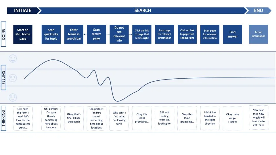
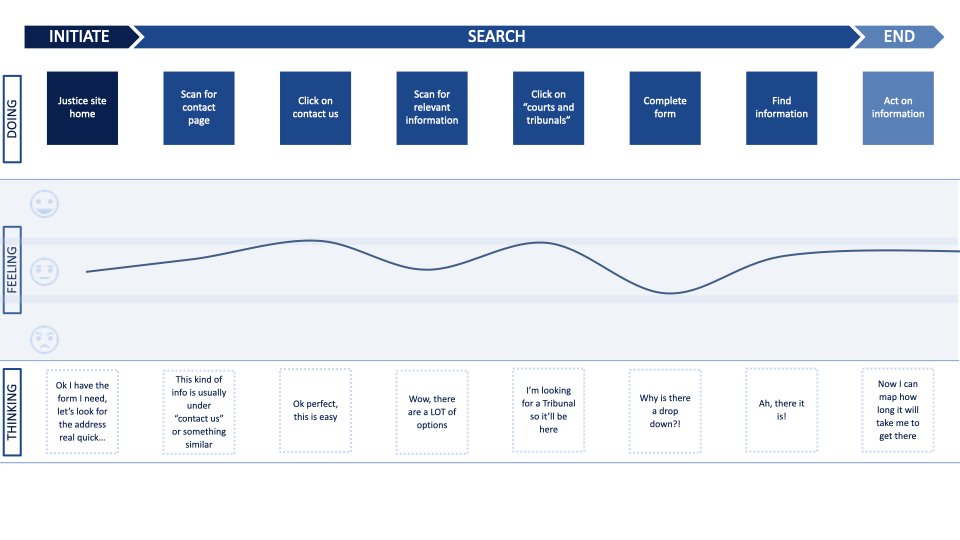
Each of the five participants followed an entirely different path to search for information on the site. I created simple journey maps to show each of these pathways (covering Thinking, Feeling, Doing, and the phases of their search), displayed below. Only four journeys are shown — one participant took a single look at the homepage and said she would “just Google it”
Areas circled in red indicate possible entry points to find information about the location of the tenancy tribunal building.
A good search experience should effectively have three steps: Locate the search tool, enter search terms, and receive the desired information. However, the multitude of search tool options already existing on justice.govt.nz makes the first step difficult for any user. Not only was it difficult to initiate the search sequence, but the many existing calls to action made it so that any added tool, such as an A.I. chatbot, would need to be an even stronger call to action. In my opinion, this would make the search experience even more overwhelming, possibly to the point of forcing abandonment. Ultimately, I recommended to the committee that a conversational search tool only be implemented once the existing web experience was improved — luckily, the evidence was compelling enough to pause the work.
Last Thoughts:
This quick project reminded me of a simple truth: most of the time, a little research (done well) is better than no research at all. In my time at the Ministry of Justice, I’ve often shied away from engaging in experience research for lack of what I deem to be “enough” time or budget. But interviewing a few people or running some quick lunchtime usability tests is often enough to garner mini-insights that will win over stakeholders and get you time for a real UXR plan.
It also reminded me of the power of what I’ll affectionately call preventative research. Early stage research often confirms the direction of a project, but when it shows major gaps, it can save your team a lot of time (and money). Understanding the low viability of conversational search in this particular scenario allowed my team to pivot their energy towards other more promising A.I. projects, and saved us from investing in something that likely would not have added significant value.


